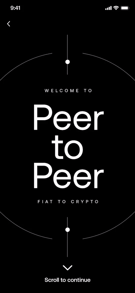
Designing trust for first-time P2P traders


New users were completing their first P2P trade at half the rate of experienced ones. The UI wasn't broken, users just didn't trust what they didn't understand. Here's how we fixed that.
Role
Senior Product Designer
Users
First-time P2P takers, offshore markets
Scope
Concept to launch, end-to-end
Ship
A/B tested
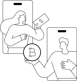
What is P2P?
Concept is like Facebook Marketplace. P2P is a peer-to-peer marketplace that allows users in offshore or underserved markets to buy and sell cryptocurrency directly with each other
01 / Problem
New users completed their first trade at half the rate of experienced ones
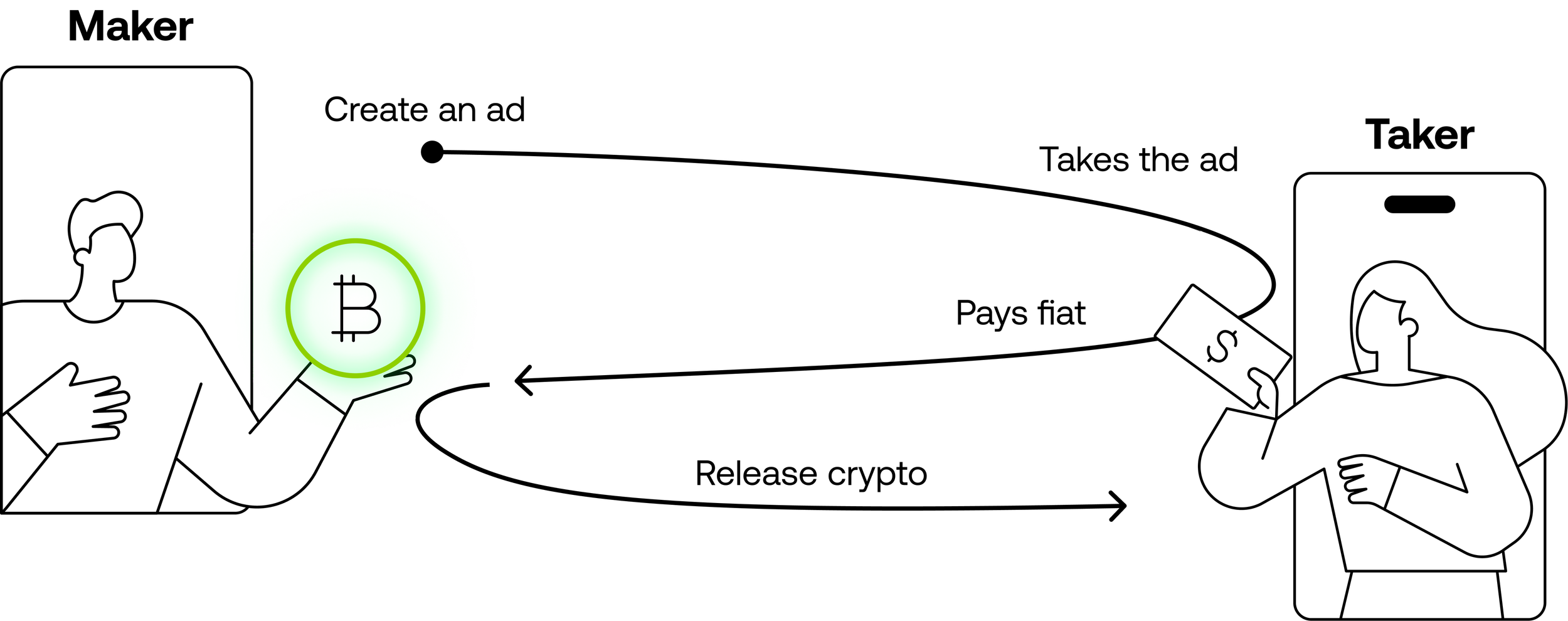
OKX P2P is the sole on-ramp channel for users in offshore and underserved markets no credit card, no bank integration, just peer-to-peer trading. For the platform to grow, new users must successfully complete their first trade.
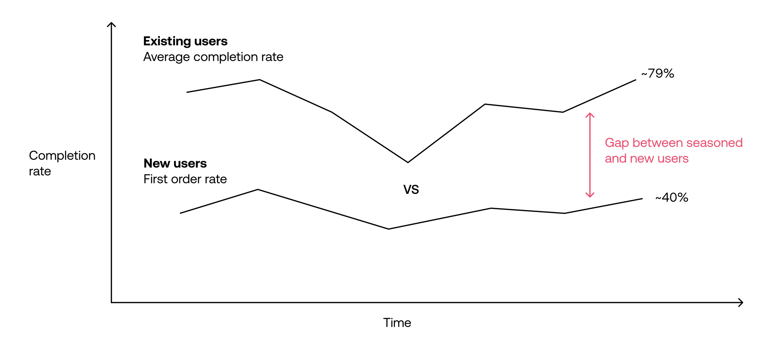
~40%
First-trade completion rate for new P2P users vs. ~79% for experienced ones a 39-point gap that weakened activation, liquidity, and trust across the entire marketplace.
Why it matters
Low first-trade completion doesn't just hurt activation numbers. It creates a trust spiral: users who abandon a P2P trade rarely return. The problem compounds at market level fewer new takers means thinner liquidity for merchants.
Primary affected segment: first-time P2P users, especially crypto beginners unfamiliar with peer-to-peer mechanics.
02 / Discovery
The existing UI wasn't broken. Users just didn't trust what they didn't understand.
Together with our researcher, we moderated research with 6 new-to-P2P users across Vietnam, Argentina, Philippines, and Thailand recruited from our existing user panel, incentivised. We combined heuristic audit with direct user sessions.
Blocker 01
Coachmarks were ignored entirely
Users reflexively closed the onboarding overlay same behaviour as any other app's permission prompt. Zero retention. We had passive education, and it was failing invisibly.
= Passive education failed
Blocker 02
P2P terminology was meaningless
New users couldn't define P2P, or explain why "Express" differed from the regular marketplace. They lacked any mental model for what a peer-to-peer trade actually meant.
= No mental model
Blocker 03
Seller matching felt opaque and scary
"Why was I matched with this person? What if they don't pay?" Anxiety before the first action meant users abandoned before placing a single order.
= Distrusted system
03 / Problem framing
The design problem wasn't onboarding it was rehearsal
P2P is a procedural, trust-sensitive flow. Reading about how it works doesn't help users need to feel they've done it before they do it for real. That reframe changed everything about how I approached the solution space.
Rejected approach
Explanatory onboarding
Long tutorial videos
Static coachmarks on key elements
Long explainer pages before the flow
Users read then face the real UI cold
Strong for scalable explanation. Weak for procedural learning which is exactly what P2P requires.
Chosen direction
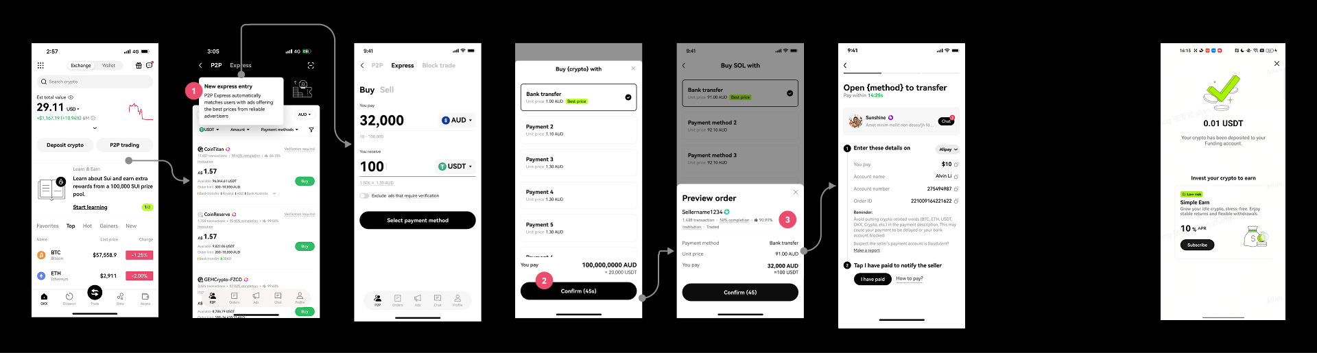
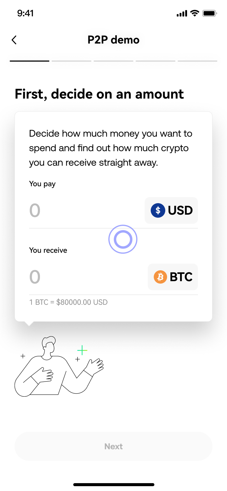
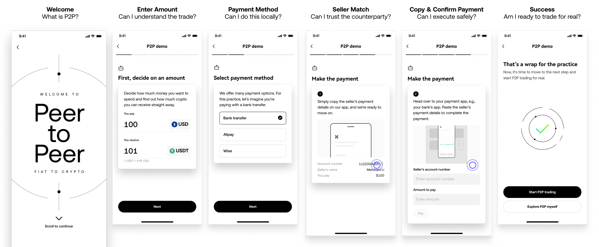
Interactive walkthrough
Simulated real trade flow 6 screens
Tap-through interaction, not passive reading
Safe demo mode zero financial risk
User exits having completed a trade once
P2P is procedural and trust-sensitive. Rehearsal helps more than explanation.
04 / Design
A 6-screen demo that walks users through a real trade, before they risk anything
P2P is a procedural, trust-sensitive flow. Reading about how it works doesn't help users need to feel they've done it before they do it for real. That reframe changed everything about how I approached the solution space.
Three small decisions with significant UX reasoning
These aren't corner cases. Each reflects deliberate trade-offs I made to serve user confidence over feature completeness.
Decision 01
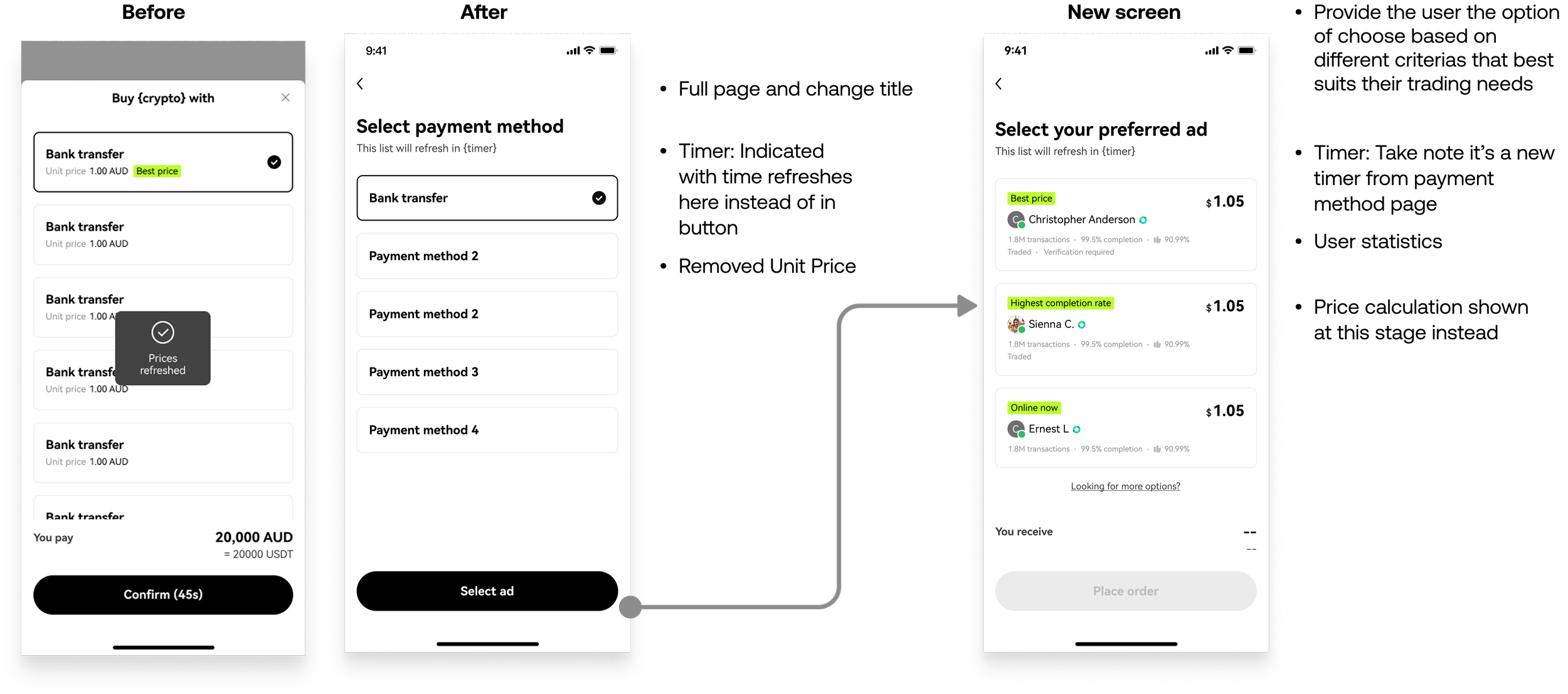
Docked scroll, not a carousel
Carousels create ambiguity users don't know if they've seen all steps, or how many remain. Vertical docked scrolling makes progress self-evident and removes a source of friction before users have established any trust.
Decision 02
Interactive demo over video
Video is passive. Users watch then face the real UI cold. The demo has the same interaction model as the actual flow: tap, enter, proceed. Users exit having physically rehearsed each step, not just watched it.
Decision 03
"Skip ahead" is essential, not optional
Forcing the full demo on returning or more confident users erodes trust differently it signals we don't respect their time. Skip is a respect mechanism: it protects agency for those who've already formed a mental model.
Designing for emotional blockers, not just functional steps
The four most common fears each mapped to a specific screen in the demo not as copy, but as structural design. The escrow mechanism is demonstrated through the seller match screen, not explained in a tooltip.
Fear → Design response
"P2P is buying from OKX" → Welcome screen: "Skip the middleman" framing + visual of peer-to-peer flow
"Payment is difficult" → Screen 3: Shows their local payment app Alipay, bank transfer familiar interface
"P2P is instant" → Screen 5: Explicit timing context 70% of trades complete within 20 minutes
"What if they don't release?" → Screen 4: Escrow made visible and named "We hold it until you confirm"
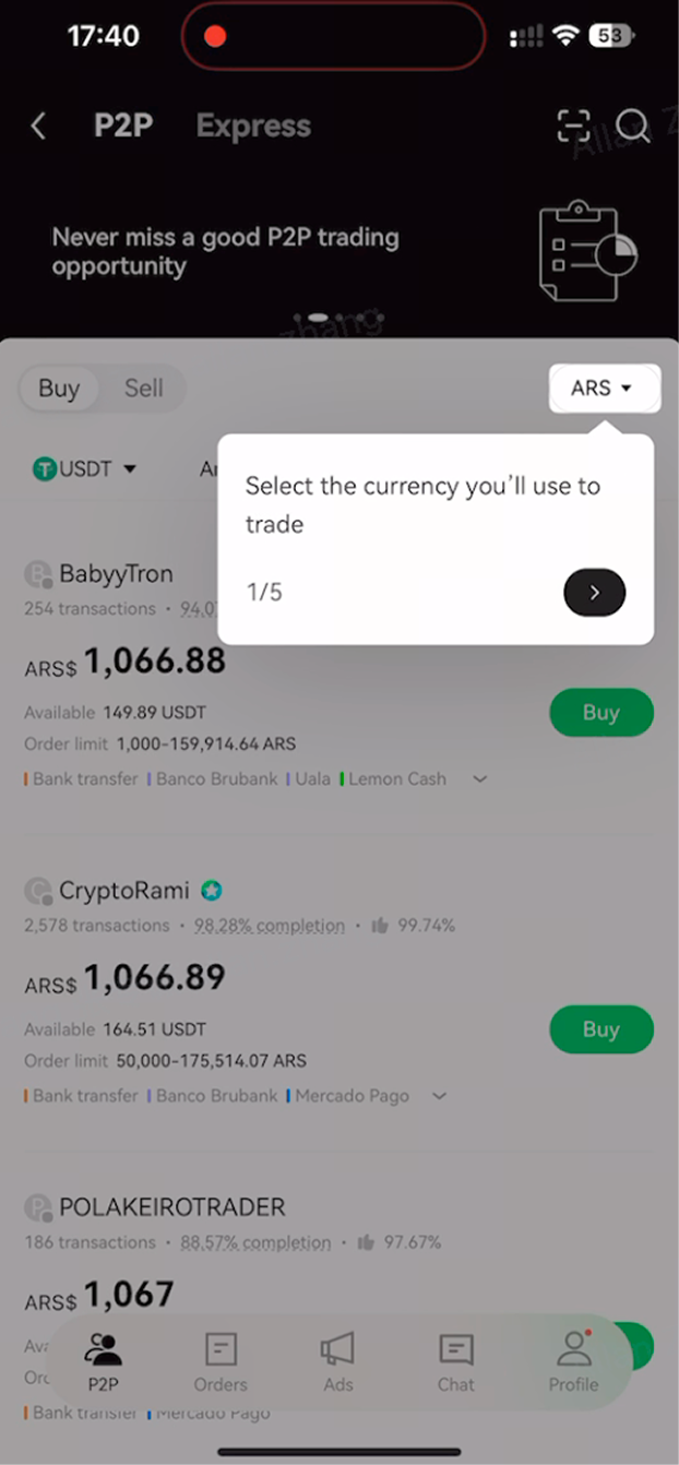
Localisation strategy
Trust signals are culturally specific. A 99.5% completion rate is reassuring in Vietnam; a seller's Alipay QR code matters in China. The demo framework was designed to localise trust signals, not just translate text.
Each market variant surfaces the payment method, trust signal, and timing expectation most relevant to that user's context rolling out incrementally as localisation data accumulates.

05 / Results
Interactive onboarding improved first-trade completion with the largest lift in Express
Randomised 50/50 A/B test on overseas first-time P2P users. ~25K–27K orders observed over 14 days. Express showed the strongest lift which makes sense: it's where context is lowest and education adds most value.
+4pt
Express completion rate
Uplift for users who saw the interactive onboarding vs. those who didn't. Express users are primarily new, small-transaction, quick-trade: the highest-need segment.
50/50 A/B · 14 days · overseas first-time users
+2pt
Marketplace completion rate
Smaller relative to Express because Marketplace users tend to be more experienced. Education has a ceiling when the user already has a mental model.
Same test cohort, different entry point
−21%
Cancellation rate from timeout
Order cancellation from timeout dropped. Users who understood timing expectations were less likely to panic-cancel during the wait window.
Post-launch 1-month measurement
06 / Design craft
Influence beyond execution: shaping the problem as much as the solution
As the only designer embedded in the P2P squad (working across 6 PMs), my role extended well beyond screen output. I want to be transparent about what "Senior PD" actually meant on this project.
Problem reframing
The PM brief was "improve the coachmarks." The right answer was rehearsal.
Getting stakeholders to fund a 6-screen interactive demo instead of an updated tooltip overlay required a research-backed reframe and a concept test not just a Figma file. Surface preference pointed to a familiar intent filter. Deeper probing revealed the demo won on the metric that mattered: would this give users enough confidence to complete a real trade?
Stakeholder alignment
A more expensive intervention required framing design decisions in business language.
Presented to brand, senior leadership, and merchant partners, not just the product squad. Aligning on a higher-fidelity solution required grounding the argument in activation rate, first-trade completion, and escrow dispute reduction rather than UX rationale alone.
07 / Fixing the flow
Beyond user education
Earlier research surfaced a third blocker: seller matching felt arbitrary. Users didn't know why they were paired with a specific seller, and that uncertainty stopped them before placing a single order.
I designed a dedicated seller selection screen to fix the moment distrust actually surfaced.
08 / Merchant side
Also designing for the dealer’s end of the trade
The education and flow work focused on new buyers. But P2P Express only works if quality merchants stay engaged too.
Merchant interviews surfaced a consistent frustration: no order history, no trading partner breakdown, no crypto flow by currency pair.
The intent was clear: keep good merchants active. OKX P2P doesn't need more merchants, it needs quality ones. Giving them a performance feedback loop was the minimum needed to help them earn more and stay engaged.
